Bolder Look: A Display Font That Commands Attention Online
As a web designer who builds landing pages, SaaS dashboards, and e-commerce experiences, I treat typography like interface logic—not decoration. Every font choice affects how fast users scan, whether they trust the brand, and where their eyes land first. That’s why Bolder Look stands out in my toolkit: it’s a display font built for digital impact without sacrificing clarity or intention.
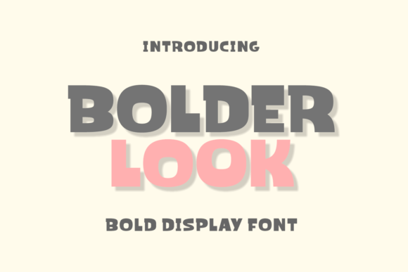
Bolder Look is bold by design—but not aggressive. Its rounded terminals, generous x-height, and friendly contrast give it charm and approachability. It’s not a script or handwritten font; it’s a confident, contemporary display typeface with personality baked into every glyph. On screen, it renders cleanly across browsers and devices, maintaining its warmth even at smaller sizes—making it ideal for hero headlines, section titles, and branded CTA buttons that need to feel human, not robotic.
In practice, Bolder Look excels where hierarchy matters most. On a product landing page, I use it for the primary headline above the fold—paired with a neutral sans serif (like Inter or Manrope) for body copy. The contrast creates immediate visual rhythm: Bolder Look sets the tone, while the supporting font handles readability and scannability. For an online boutique or creative coaching site, it adds warmth to “Meet Your Guide” or “New Collection Live” banners—without competing with product imagery or navigation elements.
It works especially well in conversion-focused layouts. On a course sales page, I apply Bolder Look to benefit-driven subheaders (“Learn in Just 20 Minutes”, “Join 5,000+ Designers”)—short phrases that benefit from typographic emphasis. Because it’s designed for display use, it doesn’t try to be a paragraph font. That discipline keeps the layout focused and prevents cognitive overload. Users don’t read *through* Bolder Look—they pause *at* it.
For mobile responsiveness, I size Bolder Look carefully: 36–48px on desktop, scaling down to 28–32px on tablets and 24–28px on mobile—always testing legibility against background contrast. On dark mode interfaces, it holds up well with light text (white or near-white), especially when letter-spacing is opened slightly (+0.5–1px). Over image overlays, I add subtle text shadows or semi-opaque backgrounds to ensure readability—never relying on font weight alone.
Font pairing is where Bolder Look reveals its versatility. With a clean, highly legible sans serif (e.g., Open Sans, Lato, or a system font stack), it forms a reliable, modern duo for digital branding. For editorial-style blogs or creative agency sites, I sometimes pair it with a warm serif (like Merriweather or Cormorant Garamond) to balance playfulness with authority. The key is keeping body copy neutral—letting Bolder Look do the expressive work while the secondary font delivers information efficiently.
It shines in specific digital contexts: portfolio site headers (“Work”, “About”, “Contact”), shop banners (“Limited Edition Drops”), app onboarding screens (“Welcome Back”, “Get Started”), and branded email headers. In UI components, I reserve it for high-impact, low-frequency elements—like modal titles or milestone badges—not form labels or navigation links. Its personality is best deployed intentionally, not ubiquitously.
When evaluating Bolder Look as a commercial font, I check three things before licensing: webfont availability (WOFF2 support is essential), included weights (a single bold weight is sufficient for display use), and multilingual character coverage (Latin-1 and extended Latin are standard; Cyrillic or Greek support depends on your audience). Most reputable vendors provide clear licensing terms—confirming usage for live websites, client projects, SaaS platforms, and digital templates. Never assume free-for-personal-use means free for commercial deployment.
Readability isn’t just about letterforms—it’s about context. Bolder Look performs best on short, action-oriented text: headlines under 8 words, button labels (“Start Free Trial”, “Download Guide”), and section dividers (“What You’ll Learn”, “Why Clients Choose Us”). Avoid long paragraphs, fine print, or dense comparison tables. Its strength is emotional resonance—not endurance.
For brand consistency, I treat Bolder Look as part of a core design system—not a one-off flourish. If your brand voice is warm, confident, and human-centered, this display font reinforces that across touchpoints: from your homepage hero to social media graphics, email headers, and digital ad creatives. It avoids the sterility of overused system fonts while staying more accessible than ultra-decorative alternatives.
Real-world examples prove its flexibility. A children’s learning app uses Bolder Look for lesson titles (“Let’s Build a Rocket!”) paired with a friendly sans for instructions. A sustainable skincare brand applies it to “Clean Ingredients. Real Results.” banners—adding authenticity without shouting. A freelance designer’s portfolio leverages it in the navigation bar (“Projects”, “Process”, “Hire Me”) to signal creative confidence upfront.
Ultimately, Bolder Look supports digital clarity by doing less—and saying more. It doesn’t try to be everything. It’s a display font, purpose-built for moments that matter: first impressions, emotional hooks, and brand-defining statements. When used with restraint and intention, it strengthens visual hierarchy, deepens brand recall, and quietly lifts user engagement—without demanding attention. That’s rare. And that’s why it stays in my active font library.